Posted June 17, 2012 at 08:12 pm
For those interested in the artistic process, I took some progress photos while I was working on page 66 so you could see how I set up the page :) And then explanation of what I'm doing, in case random photos aren't explanation enough.
Anyway.

Rather than a formal script, I have a list of what needs to happen in each chapter and how I think that'll be accomplished. I then start to breakdown each scene by taking notes (see my handy portable notebook there). By "notes" I mean I'll jot rough dialogue between characters, key actions, key visuals (if any), and other miscellaneous details.
I know my writing shorthand well enough that these brief notes give me all the information I need for setting, emotions, what the characters are doing, etc. If I have time, I try to make the dialogue as final as possible at this notes phase, but if I'm crunched for time I usually have to finalize it later on. I am trying not to let myself do that, it's not very efficient :P

I then roughly chop the scene into pages based on my notes and work out thumbnails of the first page (I try to thumb a couple at once if I can). As I thumbnail I am basically taking my notes and fleshing them out visually on the page instead of fleshing them out verbally in a script. Depending on how clear the scene is in my head, this can go really quickly or it can be super slow.
This page happened pretty quickly (maybe it's a poor example? Usually I have to cycle through at least 3-4 thumbnails). I knew I wanted to end on the panel that emphasized Rook's bike, and it was just a matter of shuffling the other panels around until the overall page looked right.
The dream pages have been my favorite so far because I needed them to look "different" from when Foyle wasn't dreaming. Since the main Missing Monday pages are very linear and boxy, the dream pages needed to be flowy and full of curves and diagonals.

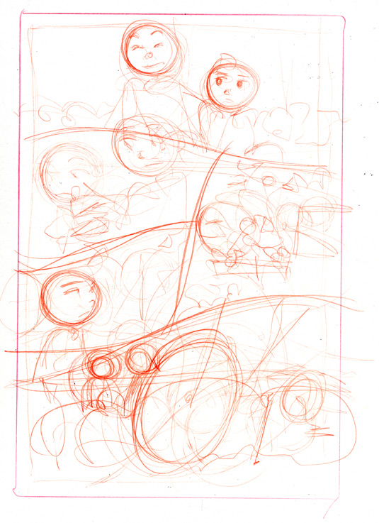
Yup. These are how my pencils look. Glorious, right? You can see that I improved upon my thumbnails and split the second panel into 2 panels. It looks better on the page and lets me show both Rook's enthusiasm and Foyle's utter lack of enthusiasm (instead of focusing on just one of their faces).
I should probably explain the red pencil because I get asked about it a lot. Erasing is annoying, especially if you tend to press into the page heavily like I do. By using a tinted pencil, I can skip erasing altogether and just use Photoshop to remove all the red from the image. This works just as well with blue or yellow (though yellow, how would you even see it to ink it?).

Since my pencils are pretty lose, the meat of the drawing happens when I ink. Maybe this is a horrible way to work, but I find that refining too much at the pencil stage makes my art look really stiff and unappealing? Winging it a little keeps it more energetic.
You can see in the photo that I usually have a couple previous comic pages on my desk while I'm working. I use them to check for consistency ("how did Foyle's mom style her hair?") and flow. If I'm not at home, I'll frequently go to the website on my phone and flip through the archives to check details as well.
I ink the panel borders first with a thick brush or brushpen. In each panel I start with the main thrust of the action (usually the characters) and work my way outward into the background. I start out with a skinny tipped felt tip pen for most of my inking. As I work I'll go back with the skinny pen or switch to a medium tip pen to tweak, refine, or add extra line weight to things. You can see the difference between my "first pass" inking and my "refined" inking if you compare the top and bottom panels in this photo.
When I'm done, it looks like this:

This is what I scan into the computer. I put a red star next to any panel where I need to do digital inking - usually this refers to sections that need to be corrected/redrawn/fixed, but it can also refer to details I prefer to add digitally, such as Rook's tatoo.
For an example of how much I correct, you can compare Rook's face to his face in the final page. When I finished inking I was horrified at how much his face looked like a meme face, so I felt I should go back and fix it to avoid distracting people ;)
From here on out, it's all me and Photoshop doing the shading and lettering. Um. Tada?
Anyway.

Rather than a formal script, I have a list of what needs to happen in each chapter and how I think that'll be accomplished. I then start to breakdown each scene by taking notes (see my handy portable notebook there). By "notes" I mean I'll jot rough dialogue between characters, key actions, key visuals (if any), and other miscellaneous details.
I know my writing shorthand well enough that these brief notes give me all the information I need for setting, emotions, what the characters are doing, etc. If I have time, I try to make the dialogue as final as possible at this notes phase, but if I'm crunched for time I usually have to finalize it later on. I am trying not to let myself do that, it's not very efficient :P

I then roughly chop the scene into pages based on my notes and work out thumbnails of the first page (I try to thumb a couple at once if I can). As I thumbnail I am basically taking my notes and fleshing them out visually on the page instead of fleshing them out verbally in a script. Depending on how clear the scene is in my head, this can go really quickly or it can be super slow.
This page happened pretty quickly (maybe it's a poor example? Usually I have to cycle through at least 3-4 thumbnails). I knew I wanted to end on the panel that emphasized Rook's bike, and it was just a matter of shuffling the other panels around until the overall page looked right.
The dream pages have been my favorite so far because I needed them to look "different" from when Foyle wasn't dreaming. Since the main Missing Monday pages are very linear and boxy, the dream pages needed to be flowy and full of curves and diagonals.

Yup. These are how my pencils look. Glorious, right? You can see that I improved upon my thumbnails and split the second panel into 2 panels. It looks better on the page and lets me show both Rook's enthusiasm and Foyle's utter lack of enthusiasm (instead of focusing on just one of their faces).
I should probably explain the red pencil because I get asked about it a lot. Erasing is annoying, especially if you tend to press into the page heavily like I do. By using a tinted pencil, I can skip erasing altogether and just use Photoshop to remove all the red from the image. This works just as well with blue or yellow (though yellow, how would you even see it to ink it?).

Since my pencils are pretty lose, the meat of the drawing happens when I ink. Maybe this is a horrible way to work, but I find that refining too much at the pencil stage makes my art look really stiff and unappealing? Winging it a little keeps it more energetic.
You can see in the photo that I usually have a couple previous comic pages on my desk while I'm working. I use them to check for consistency ("how did Foyle's mom style her hair?") and flow. If I'm not at home, I'll frequently go to the website on my phone and flip through the archives to check details as well.
I ink the panel borders first with a thick brush or brushpen. In each panel I start with the main thrust of the action (usually the characters) and work my way outward into the background. I start out with a skinny tipped felt tip pen for most of my inking. As I work I'll go back with the skinny pen or switch to a medium tip pen to tweak, refine, or add extra line weight to things. You can see the difference between my "first pass" inking and my "refined" inking if you compare the top and bottom panels in this photo.
When I'm done, it looks like this:

This is what I scan into the computer. I put a red star next to any panel where I need to do digital inking - usually this refers to sections that need to be corrected/redrawn/fixed, but it can also refer to details I prefer to add digitally, such as Rook's tatoo.
For an example of how much I correct, you can compare Rook's face to his face in the final page. When I finished inking I was horrified at how much his face looked like a meme face, so I felt I should go back and fix it to avoid distracting people ;)
From here on out, it's all me and Photoshop doing the shading and lettering. Um. Tada?
Comments
